Seasonal Color Analysis: Find Your Palette in 3 Steps
Seasonal color analysis matches your skin undertone, hair, and eyes to flattering colors. Learn the 12-season framework, find your palette, and apply it to clothes you already own.

Seasonal Color Analysis: All 12 Seasons Explained
Table of Contents
- Key Takeaways
- Introduction: Why Seasonal Color Analysis Is Having a Moment Right Now
- What Is Seasonal Color Analysis? The Core Framework Explained
- The 12 Seasons Explained: Your Complete Visual Guide
- How to Find Your Season: From DIY Tests to AI Tools
- Seasonal Color Analysis for Men: The Same System, Differently Applied
- How to Apply Your Season to Your Existing Wardrobe (Without Starting Over)
- Seasonal Color Analysis and 2026 Fashion Trends: Why Your Palette Is More Relevant Than Ever
- AI and Seasonal Color Analysis: What the Tools Can (and Can't) Do
- Conclusion: Your Season Is a Tool, Not a Label
Key Takeaways
- Seasonal color analysis organizes people into 12 seasons based on three axes: undertone (warm/cool/neutral), value (light to dark), and chroma (muted vs. saturated) — not calendar months.
- Knowing your season helps you build outfits from clothes you already own before buying anything new.
- Consumer AI color-analysis apps reach 80–85% accuracy when users provide high-quality photos in natural lighting, according to BeautySpark.
- The system is fully gender-inclusive — the 12-season framework applies identically for men.
- Treat your season as a decision-making filter, not a rigid rule.
Introduction: Why Seasonal Color Analysis Is Having a Moment Right Now
Seasonal color analysis has crossed from niche beauty theory into mainstream practice. According to coloranalysistech.com, 48,217 people completed a color-analysis quiz in the 12 months ending May 2026 — and among top retailers, Energent AI reports 83% year-over-year growth in AI-driven color typing adoption. Technology has made this system genuinely accessible for the first time.
The frustration most people hit is predictable: they take a quiz, get told they're a "Soft Summer" or a "True Autumn," and then have no idea what to do with that information. The label lands without a practical bridge to their actual wardrobe.
That gap is exactly what this article addresses. You'll get all 12 seasons explained clearly, a method for finding your own season, and — critically — a framework for applying that knowledge to clothes you already own. The timing matters, too. WGSN and Coloro's 2026 fashion forecasting centers on Transformative Teal, earthy neutrals, and emotionally resonant palettes — color directions that map directly onto seasonal palettes. Understanding your season right now means navigating this trend cycle with intention rather than guesswork.
What Is Seasonal Color Analysis? The Core Framework Explained
Seasonal color analysis is a system that matches a person's natural coloring — skin undertone, hair, and eye color — to a palette of colors that harmonize with those features. Colors within your palette tend to make your skin look even and radiant; colors outside it can make you look washed out, sallow, or tired, regardless of how much you like them in the abstract.
The system rests on three axes. Undertone describes whether your skin's underlying hue reads as warm (golden, peachy, yellow), cool (pink, blue, ashy), or neutral (a balance of both). Value describes where your overall coloring sits on a light-to-dark spectrum — a platinum blonde with pale skin sits at a very different value than someone with deep brown skin and near-black hair. Chroma describes the intensity of your coloring: muted and soft versus bright and saturated. Every season sits at a unique intersection of these three dimensions.
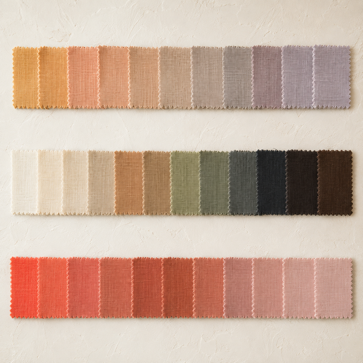
The original framework came from color theory and was popularized in the early 1980s through books on seasonal color systems, which organized people into four seasons: Spring, Summer, Autumn, and Winter. That model worked, but it was broad — grouping people with meaningfully different coloring under a single label. The modern 12-season expansion solves this by splitting each base season into three sub-seasons, giving far more precise palette guidance.
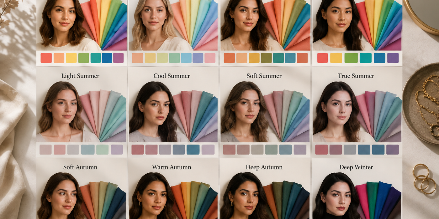
Those 12 seasons are: True Spring, Light Spring, Bright Spring (the Spring family); True Summer, Light Summer, Soft Summer (Summer); True Autumn, Soft Autumn, Dark Autumn (Autumn); and True Winter, Dark Winter, Bright Winter (Winter). Each has its own distinct palette, and the differences between sub-seasons within a family are real and consequential — a Soft Summer and a True Summer wear color very differently.
One misconception worth clearing up immediately: your season reflects your natural coloring, not your personal style preferences or the colors you enjoy wearing. It doesn't shift with the calendar. A True Autumn doesn't become a Winter in December.
The 12 Seasons Explained: Your Complete Visual Guide
With those 12 names established, here's what each one actually looks like in practice — the specific palette details that make the difference between wearing colors that work and wearing colors that fight your face.
According to a 2024 practitioner sample of 115 clients documented by colormelight.substack.com, neutral-cool palettes were the most common outcome, while warmer and higher-chroma seasons appeared less frequently. If you land in a Spring or Bright Winter, you're in a smaller subset — but the system still applies just as precisely.
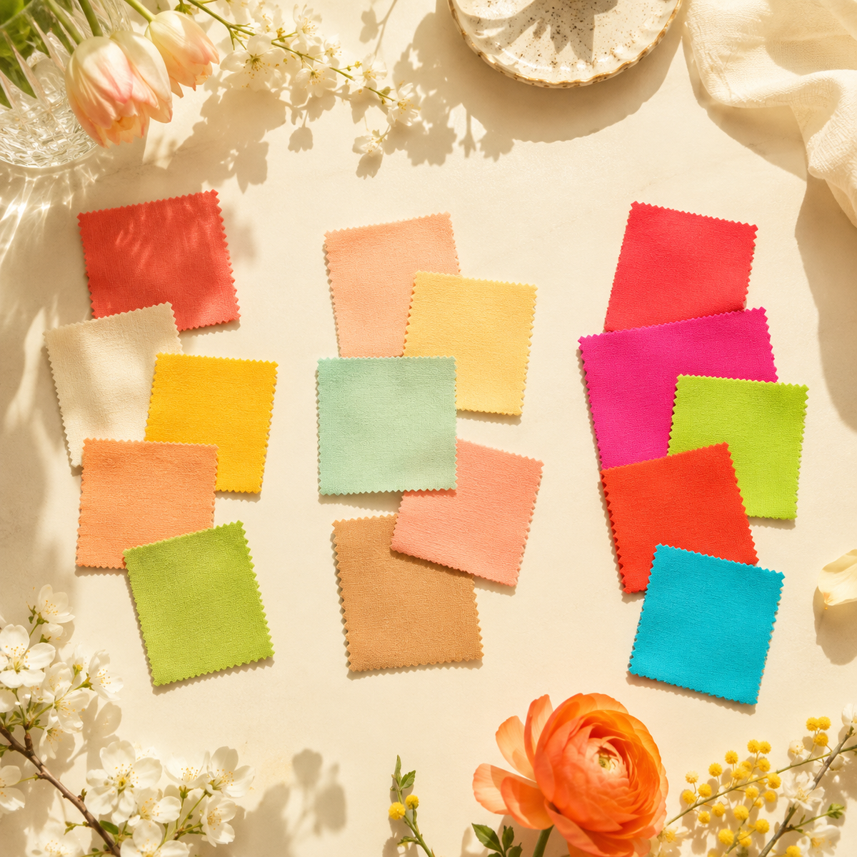
SPRING — warm undertone, light-to-medium value, clear and bright chroma
- True Spring: The purest warm-bright combination. Signature colors: coral, warm ivory, golden yellow, peach, clear aqua, warm apple green. Avoid: cool grays, black, dusty mauves.
- Light Spring: Lighter and slightly softer than True Spring. Signature colors: light peach, soft warm pink, butter yellow, warm mint, camel, light salmon. Avoid: deep saturated hues, cool charcoal.
- Bright Spring: Shares brightness with Winter but reads warm. Signature colors: hot coral, bright turquoise, warm fuchsia, vivid lime, clear orange-red, warm gold. Avoid: muted or dusty shades.
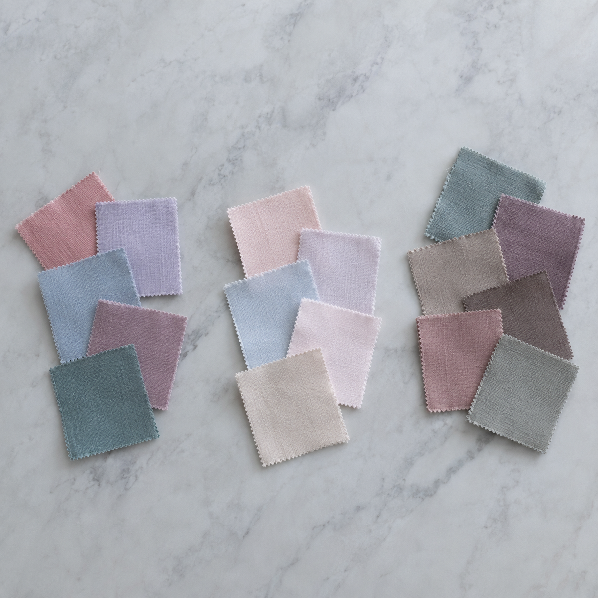
SUMMER — cool undertone, light-to-medium value, muted and soft chroma
- True Summer: The cool-muted archetype. Signature colors: dusty rose, soft lavender, powder blue, cool mauve, muted teal, rose-brown. Avoid: warm oranges, black, bright saturated colors.
- Light Summer: The lightest and softest of all 12 seasons. Signature colors: pale blush, icy lavender, soft sky blue, rose white, cool champagne, light sage. Avoid: deep or warm tones.
- Soft Summer: Sits closest to Soft Autumn — neutral-cool with very low chroma. Signature colors: dusty blue-green, muted plum, soft taupe, cool cocoa, faded rose, sage gray. Avoid: bright, saturated, or warm colors.
Ready to upgrade your wardrobe?
Get the Elara app for AI-powered styling and virtual try-ons.
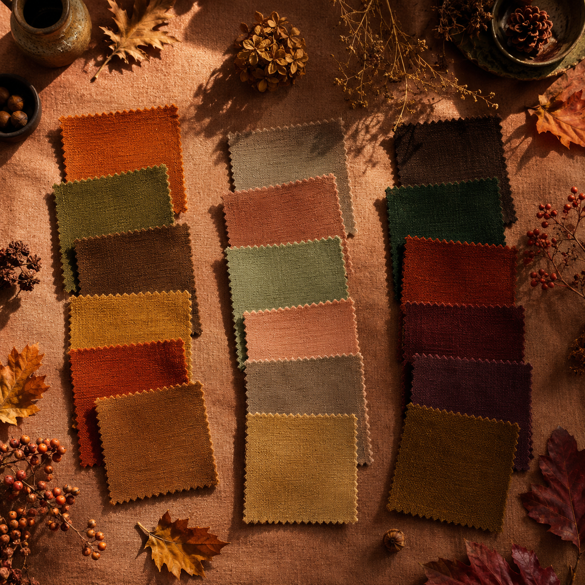
AUTUMN — warm undertone, medium-to-deep value, muted and earthy chroma
- True Autumn: The classic warm-earthy palette. Signature colors: burnt orange, olive green, warm brown, mustard, rust, dark camel. Avoid: cool pinks, icy blues, black.
- Soft Autumn: Neutral-warm and lower contrast than True Autumn. Signature colors: warm taupe, muted terracotta, sage green, dusty peach, warm mushroom, soft gold. Avoid: cool, bright, or icy shades.
- Dark Autumn: The deepest Autumn — warm but high in value contrast. Signature colors: dark chocolate, forest green, deep rust, burgundy-brown, warm plum, dark gold. Avoid: cool grays, icy pastels, black.
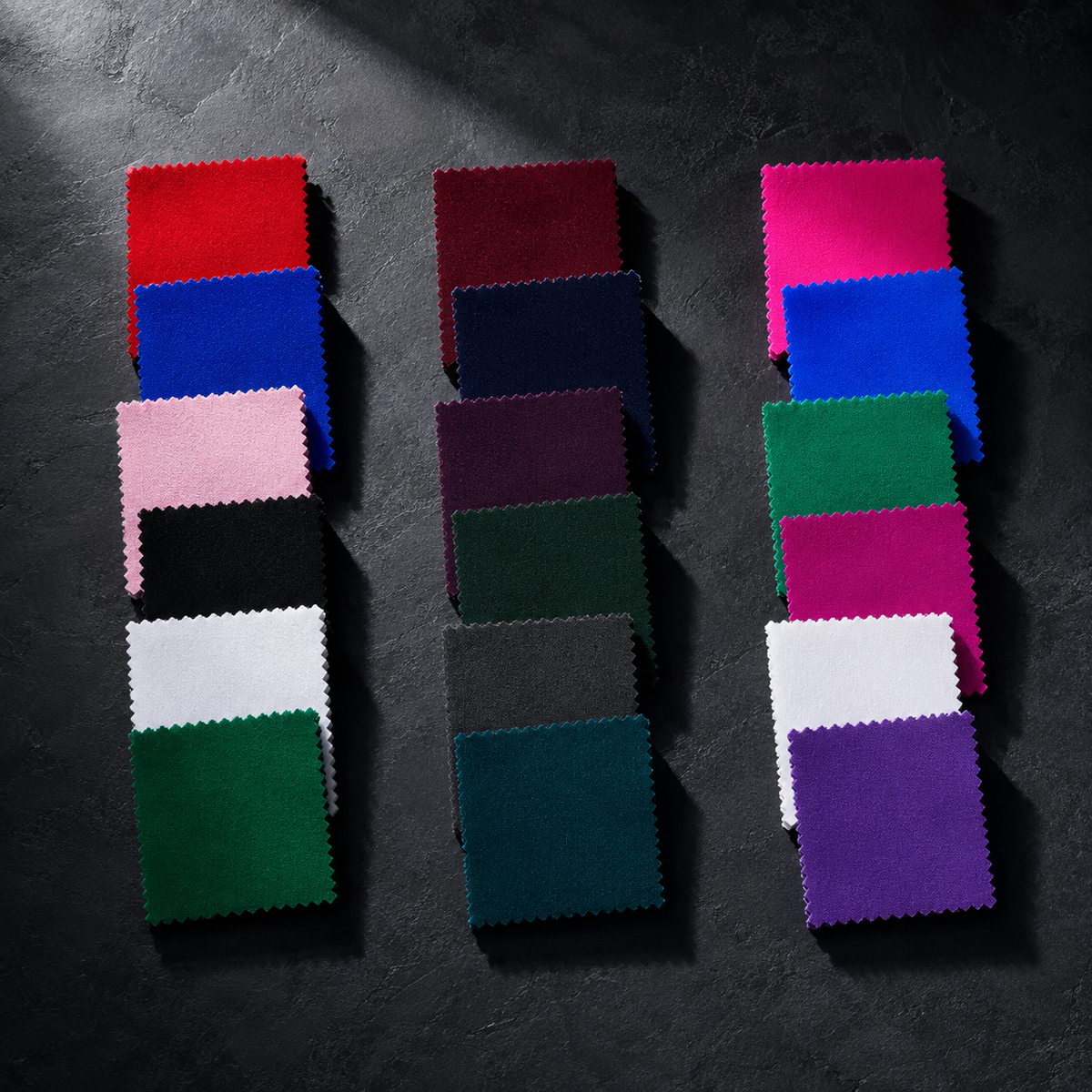
WINTER — cool undertone, deep value, high contrast and often saturated chroma
- True Winter: High contrast, cool, and clear. Signature colors: true red, royal blue, icy pink, black, pure white, emerald green. Avoid: warm earthy tones, muted or dusty shades.
- Dark Winter: The deepest Winter, with a slightly warmer lean than True. Signature colors: deep burgundy, navy, dark plum, forest green, charcoal, deep cool teal. Avoid: warm pastels, light earthy tones.
- Bright Winter: Shares clarity with Bright Spring but reads cool. Signature colors: hot pink, electric blue, bright emerald, cool fuchsia, icy white, vivid violet. Avoid: muted, dusty, or warm-toned colors.
How to Find Your Season: From DIY Tests to AI Tools
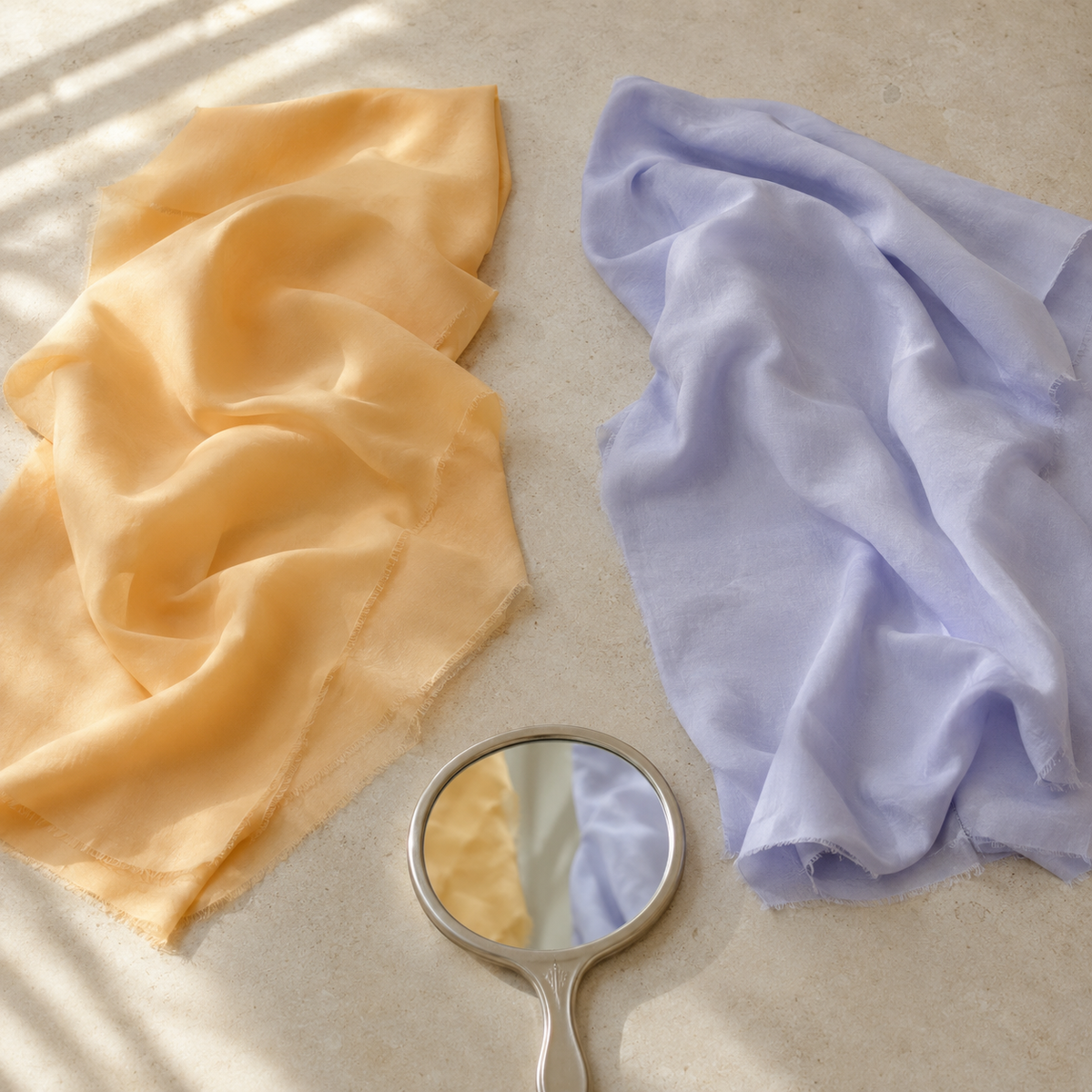
Identifying your season doesn't require a professional appointment — though that remains the most reliable path. Three methods exist, each with different tradeoffs in cost, accuracy, and effort.
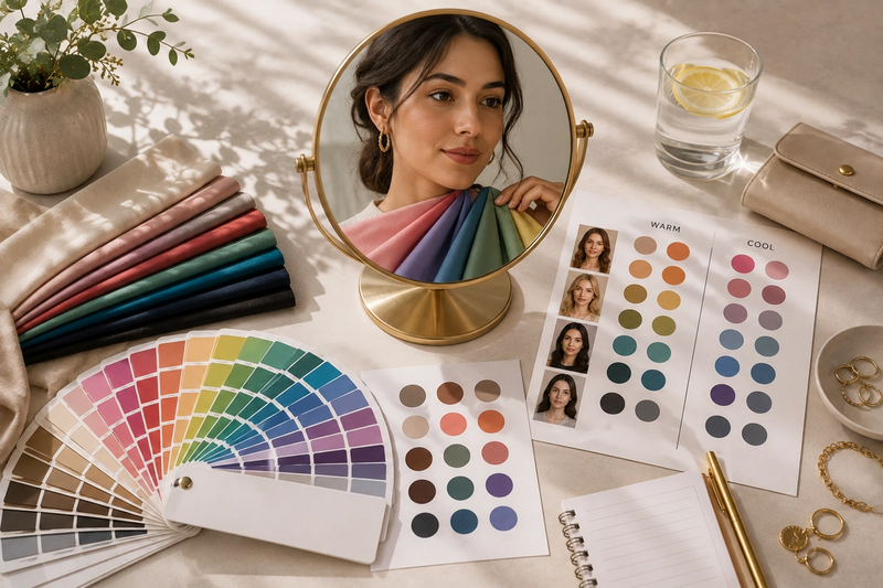
1. The DIY draping test. In natural daylight (not fluorescent), hold a warm-toned fabric — think golden yellow or peach — close to your bare face, then swap it for a cool-toned one like lavender or icy blue. The "right" fabric will make your skin look more even, your eyes brighter, and any shadows under your eyes less pronounced. The wrong one will do the opposite: emphasize redness, cast a grayish tone, or make dark circles look deeper. Take photos of both to compare objectively.
2. Quiz-based tools. Online quizzes guide you through questions about undertone, hair color, eye color, and how your skin responds to sun. According to coloranalysistech.com, 48,217 people completed color-analysis quizzes in the 12 months ending May 2026 — a figure that signals this is now a mainstream self-assessment tool, not a niche exercise. Accuracy depends heavily on honest self-observation; the quiz format works best when you answer based on your natural, unaltered coloring.
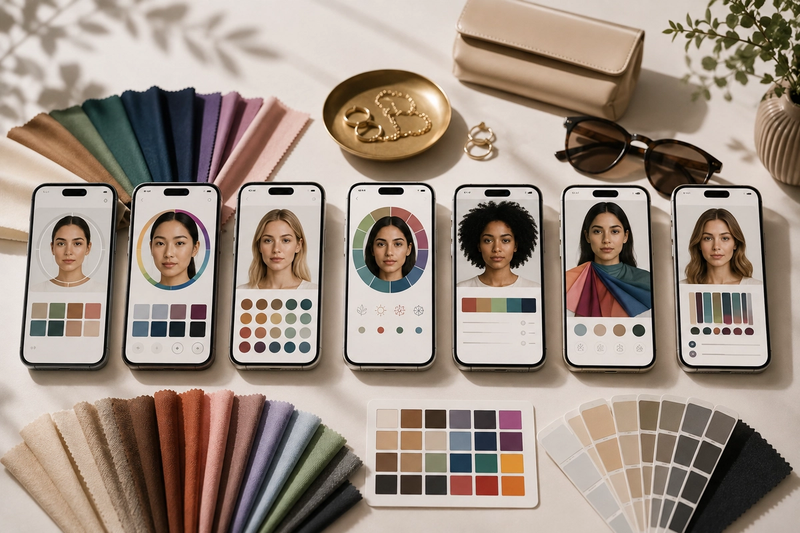
3. AI photo analysis. Consumer apps that analyze selfies for undertone and value now reach approximately 80–85% accuracy when users provide high-quality photos in natural lighting, according to BeautySpark. The practical requirement: shoot in indirect daylight, use no filter, remove heavy makeup if possible, and choose a neutral background.
Photo tip for AI analysis: Stand near a window on an overcast day — diffused natural light is ideal. Avoid direct sun (harsh shadows) and indoor artificial light (color casts). Face the camera straight-on with your hair pulled back.
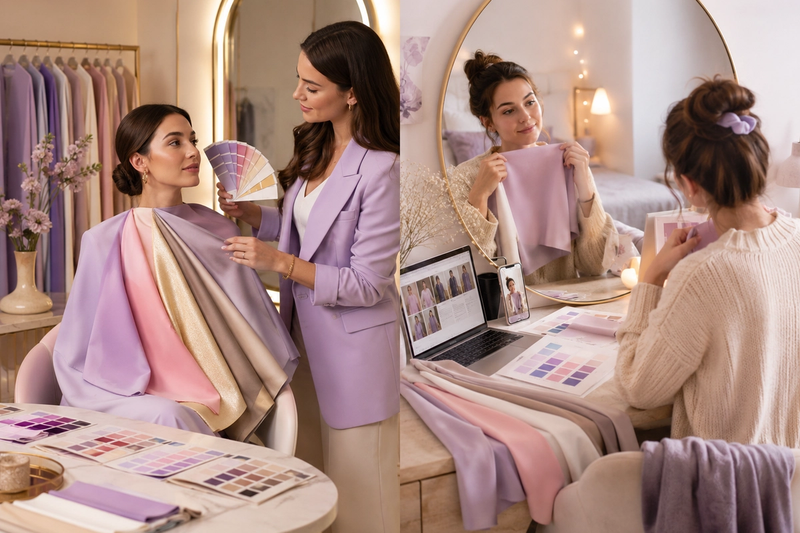
In-person professional analysis — the "seasonal color analysis near me" search — uses physical fabric drapes under controlled lighting with a trained analyst reading your skin's live response. It's the gold standard for a reason. The investment makes sense if you're between two seasons after DIY methods, or if you're about to make significant wardrobe purchases.
Seasonal Color Analysis for Men: The Same System, Differently Applied
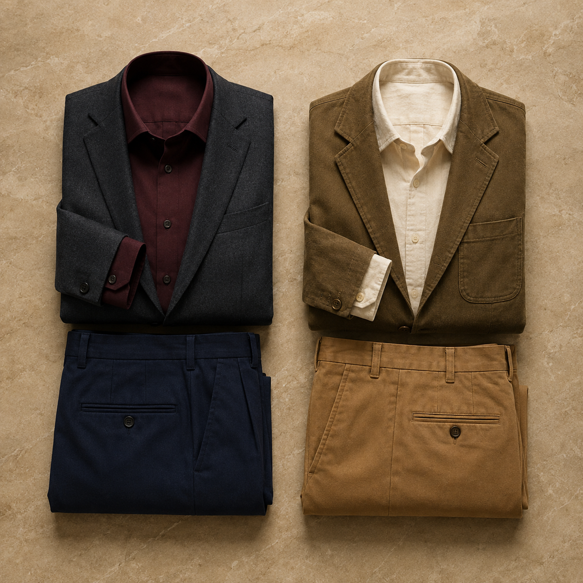
The 12-season framework is entirely gender-neutral. The three determining axes — undertone, value, and chroma — apply to men's coloring in exactly the same way they apply to anyone else's. The only difference is how the palette translates into wardrobe choices.
In men's clothing, the application is straightforward. A Dark Winter man in a charcoal suit with a deep burgundy dress shirt looks sharp and high-contrast in a way that matches his natural coloring — the depth of the colors reinforces rather than competes with his features. Put the same man in a washed-out light blue oxford and the shirt wins; his face recedes. A Soft Autumn man, by contrast, does well in warm camel chinos and an olive or warm brown jacket — those earthy mid-tones sit in harmony with his coloring — but a stark white shirt pulls focus away from his face rather than toward it.
Runway data from WGSN for S/S 25/26 shows strong movement in menswear toward dark tones, dark brown, blue, orange, and saturated expressive colors. That's genuinely useful information — but only if you know which part of that trend aligns with your season. A True Autumn man can lean directly into dark brown and warm orange without hesitation. A True Summer man should reach for the blue end of that trend — specifically cool, muted navy or slate — and skip the orange entirely, since warm saturated hues will clash with his cool, soft coloring.
Knowing your season doesn't mean ignoring trends. It means navigating them with a filter that keeps your choices coherent with your actual appearance.
How to Apply Your Season to Your Existing Wardrobe (Without Starting Over)
That filter — using your season to navigate trends — works just as powerfully when applied to the wardrobe you already own. Most people who discover their season assume they need to start fresh. They don't.
A four-step audit makes the process concrete:
- Sort your clothes into three piles: clearly in-palette, clearly out-of-palette, and "maybe" — this last pile covers true neutrals, complex prints, and accessories that don't map cleanly to a single season.
- Leave the out-of-palette pile alone for now. A warm coral blouse that doesn't serve a Cool Summer can still work as a layering piece under a jacket in a better color, or it stays in rotation for days when the analysis doesn't matter.
- Identify your gaps. After the sort, look at what's missing from your in-palette pile. No warm taupes if you're a Soft Autumn? No deep teals if you're a True Winter? That absence becomes your intentional shopping list — a direct answer to the question of what pieces will actually fill gaps in your existing wardrobe.
- Anchor outfits with bridge neutrals. Navy, camel, cream, and warm grey work across most seasons and can connect in-palette and out-of-palette pieces into coherent outfits without requiring a full wardrobe replacement.
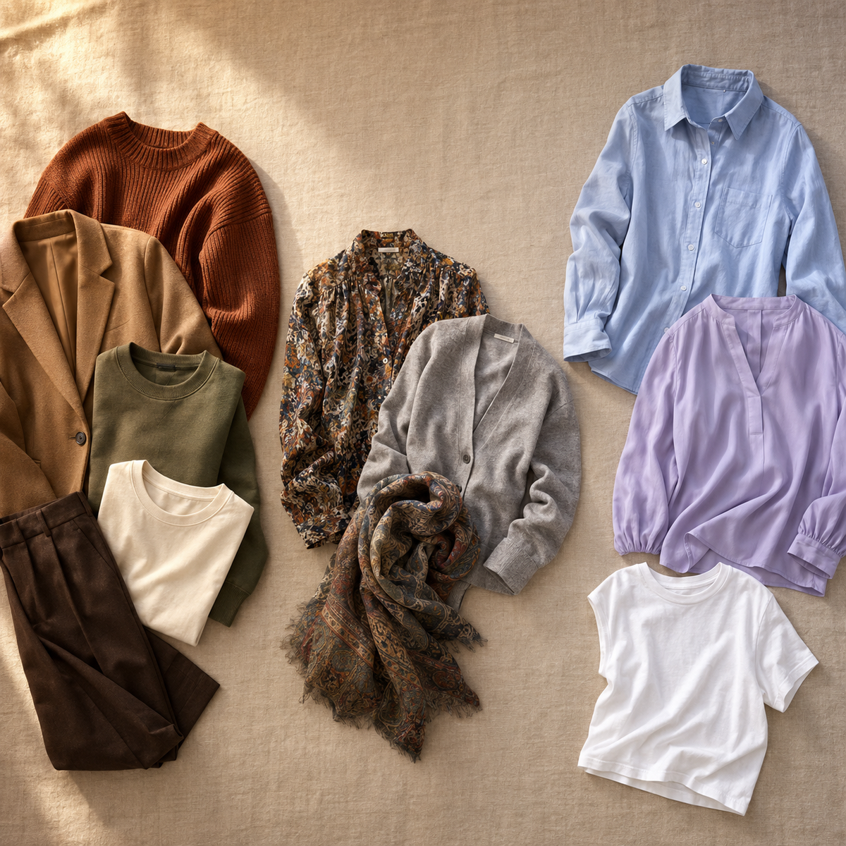
Before buying anything new, an AI stylist can digitize your existing wardrobe and surface in-palette combinations you're already missing — turning what you have into a starting point rather than a problem to solve.
Seasonal Color Analysis and 2026 Fashion Trends: Why Your Palette Is More Relevant Than Ever
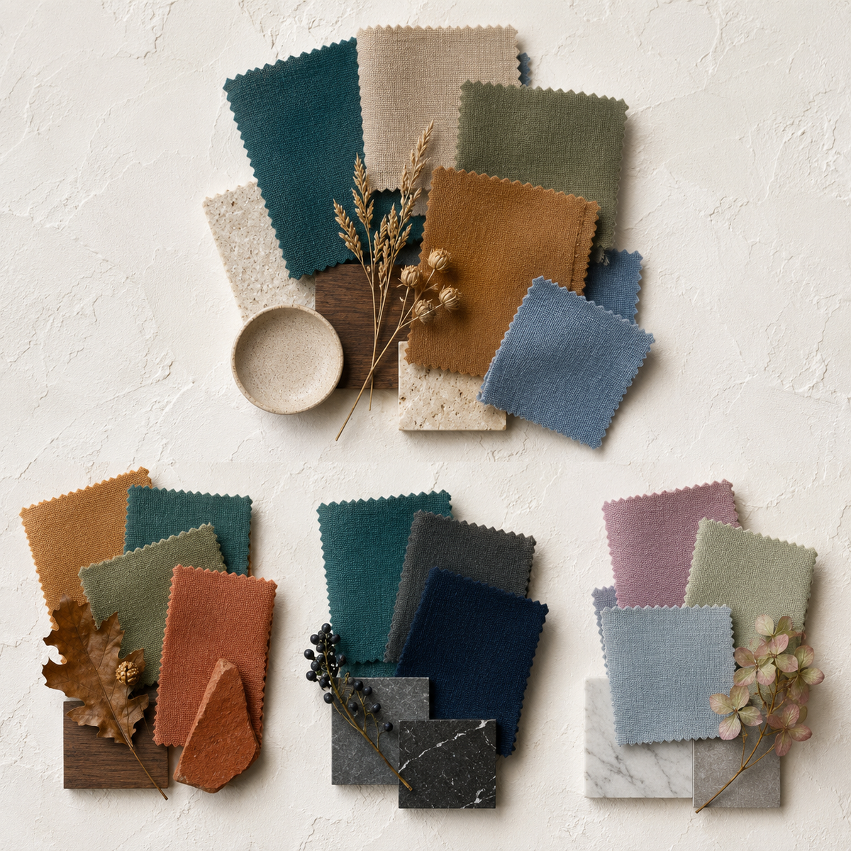
Your seasonal palette isn't a timeless abstraction — it maps directly onto what's actually arriving in stores right now. According to WGSN/Coloro, 2026's dominant color direction centers on Transformative Teal, earthy neutrals, muted greens, blues, and warm naturals. BeautySpark's trend-aware palette data reinforces this with burgundy, camel, soft off-whites, and muted greens as the season's defining hues.
The practical translation is immediate: a Warm Autumn is already aligned with 2026's earthy palette and can shop the trend without second-guessing a single purchase. A Cool Winter should skip the camel and reach for the blue-green and jewel-tone iterations of the same trend — the teal end of Transformative Teal, not the ochre end. A True Summer finds their moment in the muted, dusty blue and soft mauve directions rather than the saturated, warm-leaning versions.
According to coloranalysistech.com, search interest for color-analysis queries peaks in late summer and early fall — readers in those windows are perfectly timed to apply this knowledge before a new fashion season's inventory arrives.
Your palette is a trend filter, not a trend barrier. It tells you which slice of a broad color direction is yours to claim.
AI and Seasonal Color Analysis: What the Tools Can (and Can't) Do
AI color analysis is no longer experimental. According to Energent AI, top retailers saw 83% year-over-year growth in computer-vision adoption for automated seasonal color typing in 2026 — a figure that reflects a technology moving from novelty into standard practice.
Consumer accuracy is meaningful but conditional. Color-analysis apps reach approximately 80–85% accuracy when users provide high-quality photos in natural daylight — no filters, no heavy makeup, neutral background, face fully visible. Drop any of those conditions and the accuracy drops with them. A selfie taken under warm indoor lighting or processed through a beauty filter can shift the app's undertone reading enough to land you in the wrong season entirely.
What AI handles well: undertone detection (warm vs. cool), broad value sorting (light vs. deep), and placing most people into one of the four parent seasons. Where it struggles: distinguishing adjacent sub-seasons (True Summer vs. Soft Summer, for instance), reading unusual or neutral undertones, and working from low-light or filtered images.
Energent AI also reports that professionals using advanced AI agents in wardrobe and palette workflows save an average of 3 hours per day — a signal that the technology is mature enough to handle real workloads, not just demonstrations. For consumers, the right framing is this: treat a free seasonal color analysis tool as a strong, data-informed starting point. If you land on a borderline result — or if two seasons both seem plausible — a professional in-person analysis remains the most reliable upgrade available.
Conclusion: Your Season Is a Tool, Not a Label
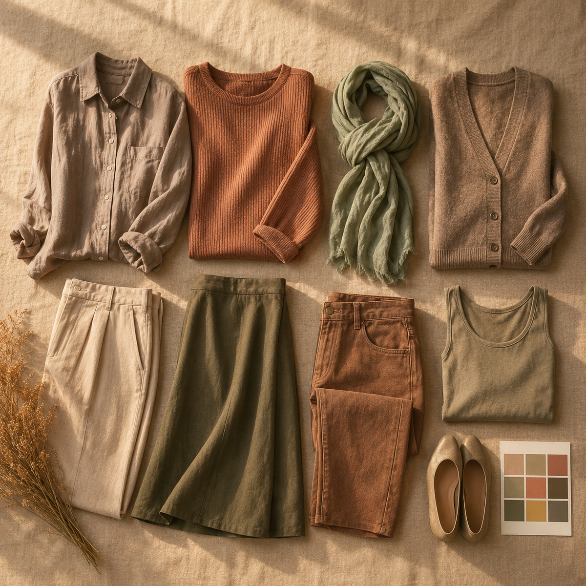
That distinction — between a clarity tool and a rigid identity — is the one worth carrying forward. Knowing you're a Soft Autumn or a Cool Summer doesn't restrict what you can wear; it collapses the decision fatigue that makes getting dressed harder than it needs to be. Your season becomes a shopping filter, a wardrobe audit framework, and a quiet confidence anchor, all at once.
The timing is genuinely useful. With AI-assisted color analysis growing 83% year-over-year among retailers and consumer tools reaching 80–85% accuracy under good lighting, acting on your season has never been more accessible or lower-effort.
If you haven't found yours yet, a free color analysis quiz is the lowest-friction starting point available. And if you already know your season but aren't sure how to build outfits from what you already own, Elara's AI stylist at joinelara.com is built for exactly that — no wardrobe overhaul required.
The goal was never to dress by the rules. It was to know yourself well enough that the rules become irrelevant.

Your AI Stylist is Here.
live on the App Store & Google Play
Available on iOS and Android for seamless access anytime, anywhere.