Color Analysis Near Me: Find Consultants & Services
Color analysis near me guides you to local consultants, online services, and DIY methods. Learn costs ($150–$500), what's included, and how to apply results to your actual wardrobe.

Professional Color Analysis vs Doing It at Home: What You Get for $200
Table of Contents
- Key Takeaways
- Introduction: The $200 Question Nobody Asks Before Booking
- What Professional Color Analysis Actually Includes (And What It Costs)
- What DIY Color Analysis Gets Right (And Where It Breaks Down)
- The 2026 Color Landscape: Why Your Palette Needs a 2026 Update
- The Real Gap: Knowing Your Colors vs. Using Your Colors
- Local vs. Remote Color Analysis: Which Model Fits You in 2026?
- FAQ
- TL;DR
Edited Article
Key Takeaways
- Professional color analysis costs around $150–$300 and delivers a seasonal palette, undertone assessment, and swatch guide. Korean-style sessions run higher, typically $300–$500, with more detailed color sub-typing.
- DIY methods are free but have real limits: home lighting shifts colors, confirmation bias skews results, and contrast assessment—the piece that separates a True Autumn from a Soft Autumn—rarely happens at home.
- In 2026, the real value isn't the palette card. It's connecting your colors to your actual wardrobe and daily outfit decisions.
- Elara translates your color profile into daily outfit curation and smarter shopping from clothes you already own.
Introduction: The $200 Question Nobody Asks Before Booking
The Globe and Mail put it plainly: "the business of colour analysis is booming again." That boom shows up in the data. Pinterest's 2026 trend forecast—built from 24 months of search and save behavior across the platform—recorded Cool Blue searches rising 85%, Persimmon up 100%, and Plum Noir climbing 220%. These aren't runway abstractions. They're what millions of real people are actively seeking out and saving to their boards.
And yet, for all that enthusiasm, the most common outcome of a professional color analysis session is a laminated palette card that gets photographed, posted to Instagram, and quietly filed away. People spend $150–$300, walk out knowing they're a "Soft Autumn" or a "True Winter," and then stand in front of the same closet the next morning with no clearer idea of what to wear.
Three questions matter here: What does a professional color analysis session actually deliver, and is it worth the price? Where does DIY analysis fall short, even when the tools are free? And—the question almost nobody asks before booking—what changes after you know your palette?
Knowing your colors is step one. What you do with them is what actually matters.
What Professional Color Analysis Actually Includes (And What It Costs)
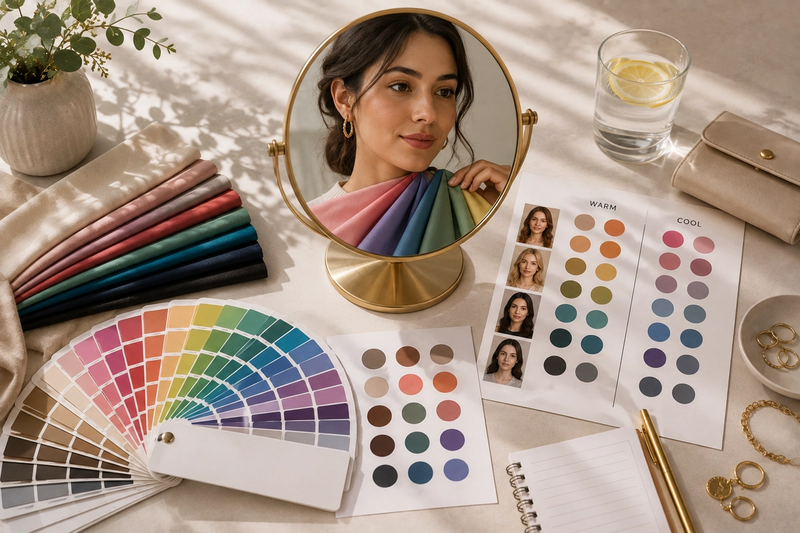
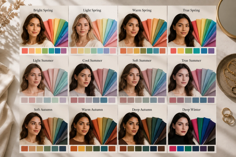
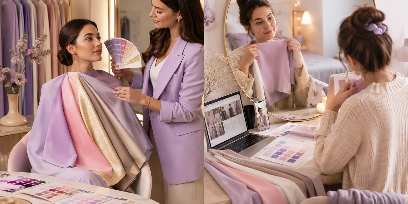
A standard professional color analysis session delivers four things: fabric draping under controlled, neutral lighting; seasonal palette assignment (typically Spring, Summer, Autumn, or Winter, with many analysts using 12- or 16-season variants); undertone and contrast level assessment; and a take-home swatch guide you can carry shopping. The controlled lighting element alone separates professional analysis from anything you can replicate at home—most residential lighting introduces warm or cool casts that distort undertone reads in ways that aren't visible to the untrained eye.
Pricing follows a clear spectrum. Standard sessions with a certified personal color analyst typically run $150–$300. Korean color analysis sessions—which have grown significantly in demand and are now offered by specialists in major North American cities—typically run $300–$500 and provide more granular sub-season typing (distinguishing Light Spring from True Spring, for example), tone-on-tone palette testing, and a stronger emphasis on makeup and hair color guidance. The Korean model's appeal is precision: clients leave with not just a season but a specific sub-type, which narrows color recommendations considerably.
The market behind these services is growing at scale. According to a LinkedIn Pulse report on the Global Colour Assessment Cabinet Market, the sector is projected to rise from $210 million in 2024 to $310 million by 2033, at a 4.5% CAGR. That trajectory reflects sustained professional demand, not a passing trend.
Geography matters, though. Finding a qualified personal color analyst within 20 miles is straightforward in cities like New York, Los Angeles, or Toronto. Outside major metros, it's genuinely difficult—which explains why "color analysis near me within 20 mi" is a search query with real frustration behind it, not just curiosity. Many people who want an in-person session simply can't find one nearby without traveling.
A professional session is a strong starting point. The draping, the controlled environment, the trained eye—these matter. The limitation isn't the analysis itself. It's what happens after: the palette card typically ends up in a drawer, and the wardrobe stays exactly the same.
What DIY Color Analysis Gets Right (And Where It Breaks Down)
That frustration with finding a local analyst points to a real market gap—and it's driven millions of people toward DIY alternatives. The appeal is obvious: free, immediate, no appointment required. The three most common methods are the vein test (blue-green veins suggest cool undertones; green suggests warm), the white-versus-cream fabric test held against bare skin in natural light, and online seasonal quizzes. These aren't worthless. At their best, they produce a rough warm/cool directional signal that helps someone start thinking about undertones—and that's genuinely useful as a first step.
The breakdown happens at three structural points. First, home lighting. Incandescent bulbs push everything warm; cool-toned LED strips do the opposite. Neither gives you the neutral daylight required for accurate undertone reading. Second, confirmation bias. Most people already have a theory about their coloring before they start, and DIY methods are easy to interpret in whichever direction confirms that theory. Third—and this is the failure point almost nobody talks about—contrast level analysis is almost entirely absent from DIY methods. The relationship between your hair depth, eye color, and skin tone determines whether you need high-contrast or soft-contrast palettes. A warm-undertoned person can be either a high-contrast True Autumn or a soft-contrast Soft Autumn, and the resulting palettes look very different on them.
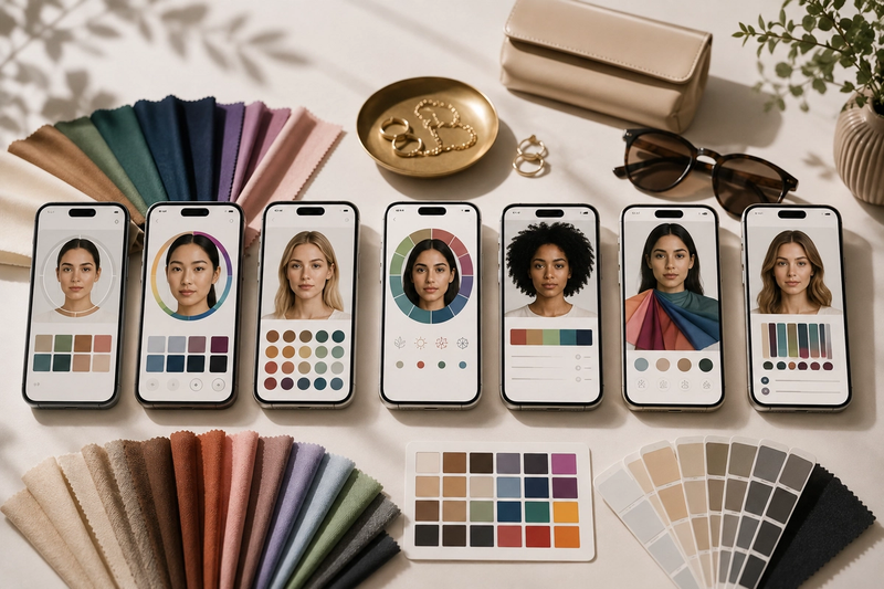
Technology is narrowing the gap. According to a 2026 LinkedIn Pulse analysis of the paint color matching software market, AI-driven color algorithms contributed over 40% of revenue growth in the color matching software sector—evidence that remote, photo-based analysis is becoming meaningfully more accurate. But it still depends on well-lit, calibrated input photos, which most people don't take.
The deeper issue, though, applies equally to a $250 professional session and a free online quiz: both produce a palette. Neither tells you what to do with it once you get home.
Ready to upgrade your wardrobe?
Get the Elara app for AI-powered styling and virtual try-ons.
The 2026 Color Landscape: Why Your Palette Needs a 2026 Update
Pantone named Cloud Dancer—a calm, warm off-white—as its 2026 Color of the Year. The choice matters practically: soft neutrals function as a palette foundation for nearly every seasonal type, which means the dominant aesthetic direction of 2026 is broadly accessible rather than exclusive to one undertone family. That's the good news. The more demanding news is that the trending accent colors of 2026 require a much more specific read.
Pinterest's 2026 forecast, built from 24 months of search and save data, shows three hues pulling hard on consumer behavior right now. Searches for the Persimmon aesthetic rose 100%, with saves up 55%. Cool Blue searches climbed 85%, with saves up a striking 215%. Plum Noir—a deep, cool-toned purple-black—saw searches rise 220% and saves surge 335%. These aren't editorial predictions from a mood board. They're what real people are actively seeking out, saving, and presumably buying. The save rates matter especially: a save signals intent to return, not just passive scrolling.
The practical implication for anyone booking a color analysis session is this: a qualified analyst in 2026 should be able to map these specific trending hues to your seasonal palette. Persimmon sits comfortably in warm autumn and spring palettes; Cool Blue belongs to cool summers and winters; Plum Noir is a natural fit for deep winters and some deep autumns. If the analyst you're considering can't tell you whether this year's dominant hues work for your season—and how to wear them—you're receiving a timeless framework without a timely application.
Before booking any local session, ask three direct questions:
- Do you incorporate 2026 trend colors into your palette recommendations?
- Which of this year's trending hues—Persimmon, Cool Blue, Plum Noir—work for my season, and how?
- Do you offer digital follow-up or any wardrobe integration guidance after the session?
An analyst who can answer all three specifically is worth the investment. One who responds with only seasonal theory and a swatch card is giving you a foundation, not a finished tool.
The Real Gap: Knowing Your Colors vs. Using Your Colors
The most common post-analysis outcome isn't a wardrobe transformation. It's a palette card that gets photographed for Instagram, maybe saved to a phone's camera roll, and then quietly forgotten while the same five outfits keep rotating through the week. The morning routine doesn't change. The shopping habits don't change. The closet doesn't change.
This isn't a failure of the analysis itself—it's a structural gap in what color analysis, as a service, actually delivers. It tells you what colors work. It doesn't tell you which pieces already hanging in your wardrobe are in-palette, which outfits to build around your best colors, or what specific item you're missing before your next shopping trip. That translation layer—from abstract palette to concrete daily decisions—has never been part of the offering.
That's exactly the gap Elara is built to close. Rather than treating color analysis as a one-time consultation, Elara takes your color profile as a foundational input to a living styling system. The scenario is concrete: imagine confirming you're a Cool Winter, then having an AI scan your entire digitized wardrobe, flag every in-palette piece, build outfits around them for the week ahead, and identify that the one navy blazer you're missing would unlock twelve new combinations before you ever open a shopping app. That's not a consultation—it's an ongoing intelligence layer between you and your clothes.
The infrastructure for this kind of integration is already scaling at industry level. According to Marketintelo's Color Management Tools Market Report, the sector was valued at $3.2 billion in 2025 and is projected to reach $5.2 billion by 2034 at a 5.8% CAGR, with cloud-based solutions identified as the fastest-growing deployment mode. The same 2026 data showing AI-driven algorithms contributing over 40% of revenue growth in color matching software confirms that the technology is maturing fast. Elara sits at the intersection of that momentum—not as a replacement for color analysis, but as the system that finally makes the results of an analysis actionable every single day.
Local vs. Remote Color Analysis: Which Model Fits You in 2026?
That market momentum—a $3.2 billion industry growing toward $5.2 billion—doesn't belong exclusively to in-person consultants. It's being driven by the remote and AI-assisted segment, and understanding which model fits your situation is the most practical decision this article can help you make.
Three models exist, and each serves a different need.
In-person local is the right choice if you live within reasonable distance of a qualified consultant and have $150–$300 to spend. The tactile experience of physical draping under controlled lighting remains the gold standard for undertone accuracy, and the consultant relationship adds context no algorithm currently replicates. If you're searching "color analysis near me" because you want that experience, book it.
Online/remote is the fastest-growing option—and not a compromise. According to a 2026 LinkedIn Pulse analysis of the paint color matching software market, AI-driven color algorithms contributed over 40% of revenue growth in the color matching software sector. Remote tools have matured significantly. If you're outside a metro area, budget-constrained, or simply can't find a qualified analyst nearby, a well-calibrated AI-assisted remote service delivers real value.
AI-assisted wardrobe-integrated analysis—what Elara offers—is the right choice if your goal is to actually use your color profile daily. The color management tools market is projected to reach $5.2 billion by 2034, with cloud-based solutions identified as the fastest-growing deployment mode. That infrastructure exists precisely to solve the gap between knowing your palette and applying it.
A simple decision framework:
- If you're near a qualified analyst and have $150–$300 → book in-person
- If you're remote or budget-constrained → vet AI-assisted online tools carefully
- If you want color analysis to change your daily routine → Elara
On the "color analysis near me free" search: free quizzes exist and can give a rough warm/cool directional signal. But accuracy tradeoffs are real—lighting, photo quality, and confirmation bias all degrade results. Elara delivers more actionable value than any free quiz, at a fraction of the cost of a full professional session.
FAQ
Q: Do I need a professional color analysis before using Elara?
A: No. If you already know your seasonal color type or undertone, you can input that directly. If you don't, Elara can help you identify your colors through conversation as you build your digital wardrobe. That said, a professional analysis gives you a precise starting point, and Elara then translates that precision into daily decisions.
Q: How long does it take to set up my wardrobe in Elara?
A: Most people photograph their closet in 30–45 minutes. You don't need perfect studio lighting—natural daylight works fine. Elara's AI handles the heavy lifting of categorizing, tagging, and cross-referencing pieces. You're not manually entering data.
Q: Can Elara work with colors I already own, even if they're not "on-trend"?
A: Absolutely. Elara's job is to make your existing wardrobe work harder for you. If you own pieces that sit unworn because you didn't know how to style them, Elara finds the combinations that bring them to life. Trends are optional—your personal style is what matters.
TL;DR
Professional color analysis costs $150–$500 and tells you which hues work for you. The real value comes when you actually use that information. DIY methods are free but structurally limited—home lighting, confirmation bias, and missing contrast assessment all undermine accuracy. Elara bridges the gap by translating your color profile into daily outfit curation and smarter shopping decisions from clothes you already own. Start at joinelara.com.
Your AI Stylist is Here.
live on the App Store
Available on iOS for seamless access anytime, anywhere.